Anti-Eviction Mapping Project
January 30, 2014
browser-based, cartography, data-visualization, museumCreated a series of maps as part of the Anti-Eviction Mapping Project, a data-visualization and digital storytelling collective working to document the housing crisis in San Francisco, California.
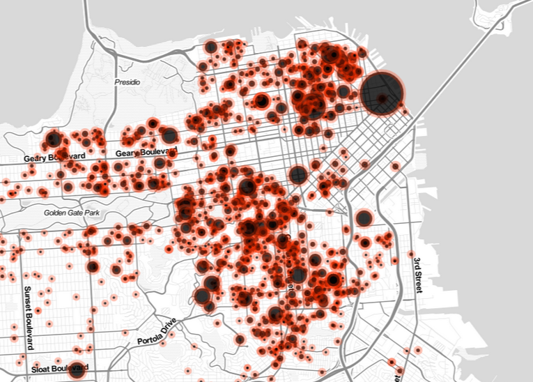 Animated map of Ellis Act Evictions in San Francisco, 2007-2011.
About
Each individual dot on these maps is a building in which all of the residents were evicted through no fault of their own. The size of the dots corresponds to the number of units in each building, and the map is animated to show the cumulation of these evictions over time.The data used in these maps comes from the SF Rent Board and the SF Planning Commission. Maps showing housing data are nothing new, and have frequently been created by real estate companies and the assessors office to provide information to home buyers and landlords. These real estate maps are created with the very specific purposes of expediting the process of buyng and selling houses, in other words of displaying the economic rather than the human side of the housing market.
As a collective of activists and techworkers, the Anti-Eviction Mapping Project is interested in exploring and exposing the power relationships underpinning housing changes in the Bay Area. Some driving questions in this project have been:
- What would a map of housing data created from the perspective of tenants, rather than home-buyers, look like?
- In what ways is data perceived as “objective”, while actually reinforcing existing hierarchies of power and points of view?
- How can a visualization evoke a more human realtionship to the data it represents?
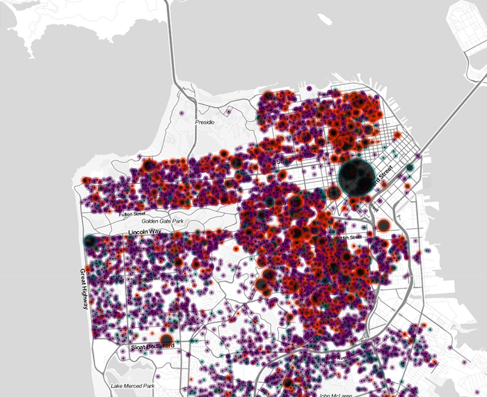 Map of all
No-Fault Evictions in San Francisco, 2007-2011.
Map of all
No-Fault Evictions in San Francisco, 2007-2011.
Design & development: Olivia JackConcept and data gathering: Anti-Eviction Mapping Project
Created using d3.js, Leaflet, and CartoDB. Code on Github.
Press #
- Atlantic Cities
- Curbed SF
- SF Bay Guardian
- SF Street Sheet
- The Bold Italic
- Google Maps Mania
- SF Examiner
- See Through Maps Exhibition, Global Urban Humanities Initiative and Berkeley Center for New Media
- Pando Daily
- The Bold Italic
- Capital and Main
- Model View Culture
Al Jazeera+ made a video using the map: